Monday 30 January 2012

Baartmans and Siegel


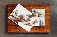
Rose highlighted that Baartmans and Siegel were her competitors, sharing similar values in modern traditionalism, interactivity. There branding is simple as with most high end fashion brands and uses a modernist Sans Serif in caps.

Baartmans and Siegel is a dynamic, luxury menswear label, that believes in creating interactive, innovative garments, and is currently shaping the landscape of contemporary menswear.

Friday 27 January 2012

Julia - London


London based studio Julia create some amazing publications and identities, using contemporary typography. I'm really interested in working with full bleed black and white photography after finding Volt and experimenting with some bespoke typefaces.

Adriaan Mellegers


Frame, a Dutch contemporary interior magazine was redesigned in 2011, Adriaan Mellegers was a part of the team that worked on the redesign. They created a content driven layout that is simple and to the point and a flexible typographic identity. The overlaying type and changing colour palette works so well over several issues.

Houman Momtazian


Houman Momtazian is a London based CSM graduate. The above project 'Yes Way' for a music and art festival is a collection of content from people involved and divided into separate formats and stocks and bound together. Its an interesting take on the traditional publication and inspires plenty of new ideas on how to go about designing a new publication. the colours and bold type well to support the experimental format.

Rejane Dal Bello / Studio Dumbar


Rejane Dal Bello is a Brazilian born designer currently working for Dutch studio Dumbar. I've started to look into other things than just a publication and more of how a brand can work across a range of media. The design above is for Dumbar Design College and the overlaying type that works as a brand can be altered to fit other contexts such as a promotional poster or publication, the well chosen colour palette only adds strength to the concept by highlighting the typography of the identity.

Wood McGrath


The publication for Design, Architecture and Cultural relations is a perfect example of the subject/content I want to be working with. The design itself is simple and not over complicated, which I think compliments the subject by allowing the content to not be overpowered.
All designed by Wood McGrath a London studio who have a vast portfolio of creative and culture sector clients, they are at the top of my list of studio to contact. I've also started to look more into website design and especially simple stripped back websites like the one above, I think it's a skill that studios appreciate and would only add to a portfolio if I had a few website projects if only small ones.

Thursday 26 January 2012

Ben Critton


Ben Critton is a prolific designer based in the US and sometimes the UK or the Netherlands., he works for Colophon type foundry as well as working freelance. His work is contemporary and utilises the current cultural trend in design whilst still having his own voice.

Motherbird


Looking into look books has taken me away from the expected fashion content of one and lead me to Gawaa Miyay's Homeware look book. Designed by Motherbird in Melbourne the publication echos the brand and collection, everything right down to the singer sewn binding visually tells the story of the indigenous inspired collection.

Three60


Three60 are a Melbourne design studio, they primarily work on fashion projects and they couldn't be more of a perfect fit for me. They work across a range of media to amplify a brand, in some cased they are given charge of a season look book like the first project above. The high end sophisticated feel to the look book works fantastic with the photography and the insert of a delicate typeface just adds to create an impressive publication. The branding above is simple but still holds character and allows the products to shine through.

Atelier Carvalho Bernau


Atelier Carvalho Bernau are a Netherlands based agency specialising in book and publication design and identity programmes. They also work on web and exhibition space projects. The project above is a documentation of the “Typographic Matchmaking in the City” project that brought five teams of type designers and architects/urban planner together between 2008 and 2010. These teams created proposals for multi-lingual, multi-script typographic installations in public space. It's one of the most well executed publications I've come across, using a variant range of coloured stocks and brilliantly displayed photography through strict layout.


Brunswicker


Based in Copenhagen Brunswicker are a multi-disciplinary studio working on projects for the fashion, lifestyle, design and media industries. The project above is for the Copenhagen fashion fairs CPH Vision and Terminal-2, displaying emerging talent and the upcoming seasons strongest designers. The layout brings out the best in the images and even the use of overlaying type doesn't take anything away from the designs, simple type layout allows the eye to scan the various clothing photography and artwork.