r by Holoahan Dev
Second idea for Rose's identity, much more simpler and cleaner than the previous idea route. The idea directly stems from Rose's statement describing her self practice, "modern
interpretation of traditional tailoring" where I take a traditional typeface and a modern typeface and use one for the R and another for the name.

Wednesday, 29 February 2012
Circular 17 - Pentagram


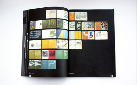
The latest issue of Circular, the magazine of the Typographic Circle, is out now. The ninth consecutive issue designed by Domenic Lippa and his team, it is the first to dispense completely with editorial typography.
Lippa has had a long standing relationship with the Typographic Circle, serving on the committee for many years and also as its chair. Unlike some other organisations, the Typographic Circle prides itself on providing a platform for a number of voices rather than promoting a single view. This means that the task of designing a magazine for all these disparate voices can prove hard. For this reason, Lippa has always wanted to create an issue containing no typography, allowing the work to speak for itself.
However this decision presents unique problems in how to convey information. The solution was to include all the necessary printed information on a slipcase, leaving the rest of the magazine type free. The magazine cover, printed in luminous magenta, contains nothing but a silver circle without even the issue number or logo, and the back section contains thumbnails of all of the spreads to ease navigation. Contributors sent in work which was edited by Lippa, Val Kildea and Louise Sloper with the support of Chairperson, John Bateson.
Thanks to the generous support of GF Smith a limited edition of seven additional colourways has been printed on a number of different paper stocks.
Cicular 15 - Pentagram/Domenic Lippa


Domenic Lippa has designed issue fifteen of Circular, the magazine of the Typographic Circle, a not-for-profit organisation run entirely by volunteers which formed in 1976 to bring together anyone with an active interest in type and typography.
Lippa has a long-standing relationship with the Typographic Circle, previously acting as its chairperson for two years. Circular Fifteen is the eighth issue of the magazine Lippa has designed in as many years.
Each issue of Circular is designed from scratch by Lippa and is produced with its own size, choice of papers, typefaces and layout, making each issue unique and highly collectible.
For issue fifteen Lippa developed a new logo, creating a roundel resembling a ‘C’ out of the words ‘Circular Fifteen’. This roundel also forms the basis for a limited edition poster, designed by Lippa to promote the magazine.
The cover of Circular Fifteen carries an image from Harry Pearce’s photographic collection of found type. The magazine features articles on design and typography contributed by the Typographic Circle’s network of members and collaborators, such as an Alan Fletcher retrospective written by Quentin Newark and an extract from Richard Hollis’ new book on Swiss typography.
Circular 16 - Pentagram/Domenic Lippa/Rishi Sodha


Circular - The typographic circles annual magazine. Each issue showcases a range of typographic talent and celebrates their work. The D&AD brief asks that the supplement sit well next to previous work that the Typographic circle have done, however I very aware not to produce anything to similar or pastiche.
Modular type development

After realising to make modular type distinctive I had to make clear separations of each character using strokes. It wasn't enough to mould type together seamlessly, it looked too unnatural. I then as seen above developed the idea of using separate 'parts' from a different character. Again this lead to nowhere and doesn't work as successfully as hoped.
The Typographic Circle

The Typographic Circle was formed in 1976 to bring together anyone with an interest in type and typography. They are a not-for-profit organisation run entirely by volunteers and stage a variety of type and typography related events including a series of diverse monthly lectures by well-known industry speakers.
Tuesday, 28 February 2012
idea 1 development

Development of one of my initial ideas for Rose's identity. Creating modular typography to compliment her modular style whilst using traditional typefaces with contemporary founts which I hope expresses her contemporary take on traditional tailoring. Some of the results haven't come out as I'd hoped but theres a few developments that I can push further that I think may come out good.
William Caslon


William Caslon founded the Caslon Foundry at around 1720, which became the leading English typefoundry of the 18th and early 19th centuries.
After the death of William Caslon I, his son William Caslon II took over the Caslon Foundry business, which lasted until William Caslon IV sold the foundry to Blake, Garnett & Co. In 1792, William Caslon III sold his share of Caslon Foundry to his mother and his sister-in-law, the widow of his brother Henry. In the same year, William Caslon III purchased the Salisbury Square foundry from the recently deceased Joseph Jackson, and renamed it to Caslon & Son. In 1807, Caslon & Son was passed to William Caslon IV. In 1819, William Caslon IV sold the Caslon & Son to the new Sheffield foundry of Blake, Garnett & Co. In 1837, the Caslon Foundry became the property of Stephenson, Blake & Co. The family of William Caslon III's sister-in-law kept the main Caslon foundry running until 1937, when Stephenson Blake acquired the remaining H.W. Caslon & Sons foundry.
Stephenson, Blake and Co.Ltd Type foundry


Sheffield typefoundry was started in July 1818 by silversmith and mechanic William Garnett and toolmaker John Stephenson, financially supported by James Blake, seemingly with little prospect for success.
However in November of that year news came that the breakaway Caslon foundry (formed when William Caslon III left the original Caslon foundry in 1792) was put up for sale by William Caslon IV. In 1819 the deal was concluded and Blake, Garnett & Co. were suddenly in charge of one of England’s most prestigious typefoundries. In 1829 Garnett left to become a farmer. The company was renamed Blake & Stephenson in 1830, but Blake died soon after. It became Stephenson, Blake & Co. in 1841. John Stephenson died in 1864, the year after he handed control to his son Henry.
Over the years the company has acquired: Fann Street Foundry (1906); Fry’s Type Street Letter Foundry;H.W. Caslon & Sons (1937); Miller & Richard (1952). Thus it inherited almost the entire British fine printing industry. In recent years the matrices and other typographic equipment, by then of little commercial value (but of great historical value), were passed to Monotype and now form a key part of the Type Museum in London. Members of both the Stephenson and Blake families still sit on the board of the present company.


An A-Z of Type designers - Neil Macmillan
Currently reading this book for research into old typefounders and contemporary typefaces. I have two initial idea routes. 1 being the use of two typefaces, a relic from a bygone era and a much more contemporary designed fount. The second idea is to create a modular typeface to mirror her discilpline as a modular fashion designer, this idea would combine two typefaces and have interchangeable elements both ideas need developing and refining but both could be quite interesting.
4 Line to 20 Line British type specimen

Letterproef 1841


Came across Holle Romein No. 4 again in this rare specimen book form 1841. Started to develop the idea of creating a modular typeface using elements from an old established typeface and a relatively new typeface to create an interchangeable working typeface.
St Bride printing Library

Whilst initiating research into the type foundries of Old London (some dating back to the 18th century) I came across St Brides printing Library, which holds an impressive collection of specimen books, directories and over 50,000 books on typography. The library also boasts a collection of artefacts recovered from old type foundries that would of otherwise gone to scrap. A research visit here would be perfect for my investigation into old type foundries and their typefaces they worked with, unfortunately however the library is closed until further notice with only the workshops continuing as normal. I've been able to source images from the library of certain specimen books (Jon. Enschede en Zonen, 1825, Proeve Van letteren,) which are displayed below but quite disappointed that I can't actually get to the library.


The examples I could source are quite interesting though especially Holle Romein no.4 and no.6, they have a quality of delicacy and grandeur that would suit a fashion brand in the area of tailoring.
Monday, 27 February 2012
visual research into inside labels/swing tags
Labels
For some reason Scribd will not show the entire collection of images if this error occurs when viewing please click the link at the top of this post to view the full collection of images.
For some reason Scribd will not show the entire collection of images if this error occurs when viewing please click the link at the top of this post to view the full collection of images.
Monday, 20 February 2012
Swingtag proposals sent through to Rose


These were the proposals and variations that I sent through to Rose, The colours used were sampled from the palette she provided and the two colours I chose I believe are the strongest and most powerful. She ended up selecting the 1st design with the customised 'Hill House' typeface, I would of preferred to move forward with the bespoke typeface but I now plan to develop this for another project.